It’s All in the Details: Laurel Glen Leasing Office
This Manteca, Ca leasing office design is a great example of how adding a few special details can really make a project! Prior to construction, the property’s office was being run out of an apartment unit. This set up was not the most functional way for on-site staff to operate and didn’t provide the warm welcome to current and future residents that the property owners were looking for.
The new office structure is located at the main entrance to the community and is designed with the roof line opening up towards the central drive, a gesture that invites people into the space. The building design takes inspiration from the surrounding architecture and incorporates the shed roofs, stacked stone, and siding materials seen on the adjacent apartment buildings. The additional details mentioned below help distinguish the office as a central community space, while maintaining continuity with the rest of the site.
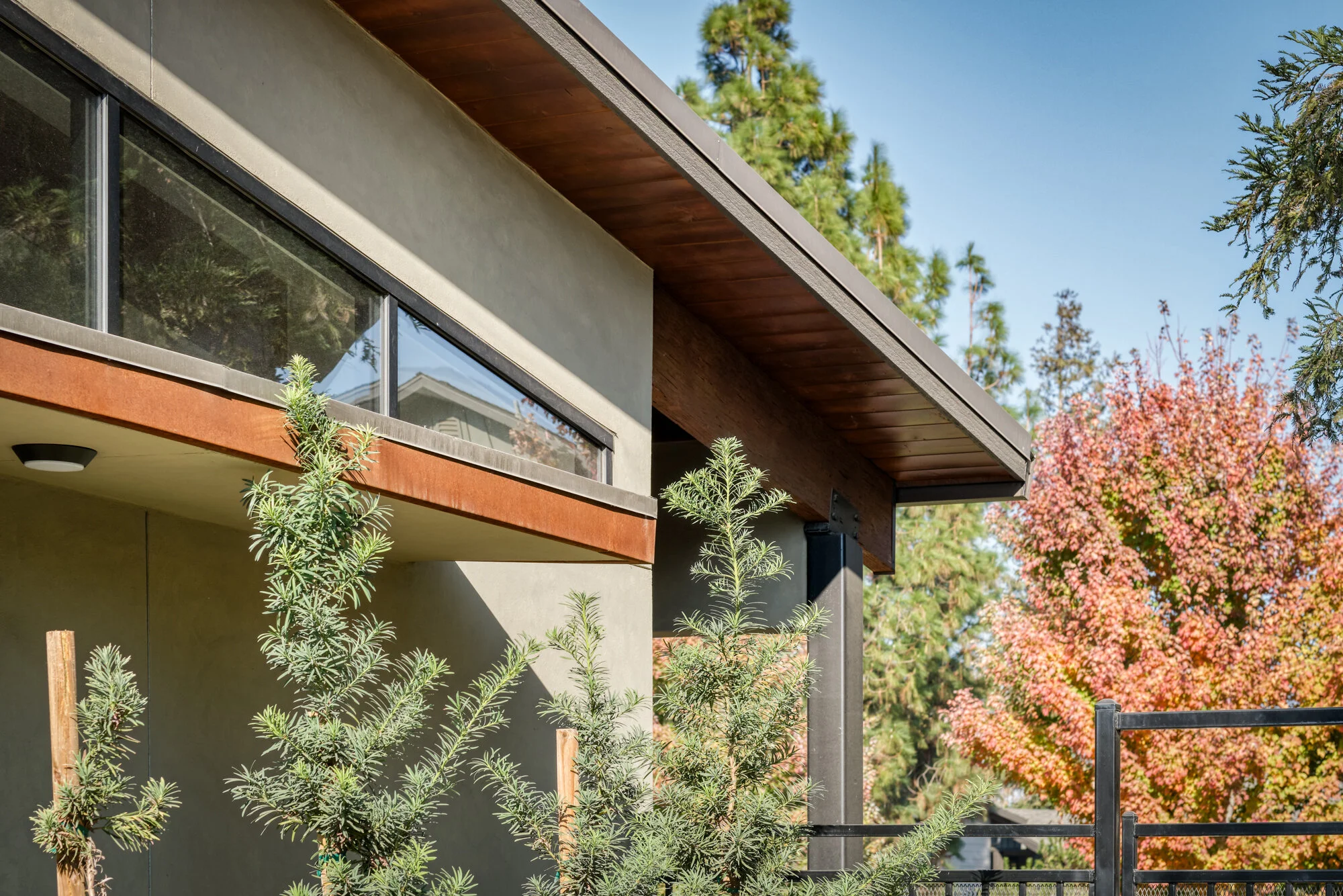
Corten Steel Accents: The rust colored metal helps bring warmth and texture to the clean-lined structure. Corten steel is incorporated into the canopy fascia, address numbers, and planters.
Stain Grade Exposed Beams & Soffit: Taking a cue from the mature redwoods, the exposed beams and exterior soffit were stained to enhance the natural setting of the building.
Custom Site Furniture: Incorporating the stained wood and Corten steel palette into these custom-designed benches helps unify the new office structure with the surrounding landscape.
Chimney & Beam Caps: The dark bronze steel chimney cap ties in with the balcony railings seen throughout the property and gives the stacked stone a clean finish. Similarly, the beam caps seamlessly tie into the color and material palette, while also providing needed protection from the elements.
Custom Teak Desking: Incorporating stained wood elements into the desking helps ground the contemporary interior furnishings.


